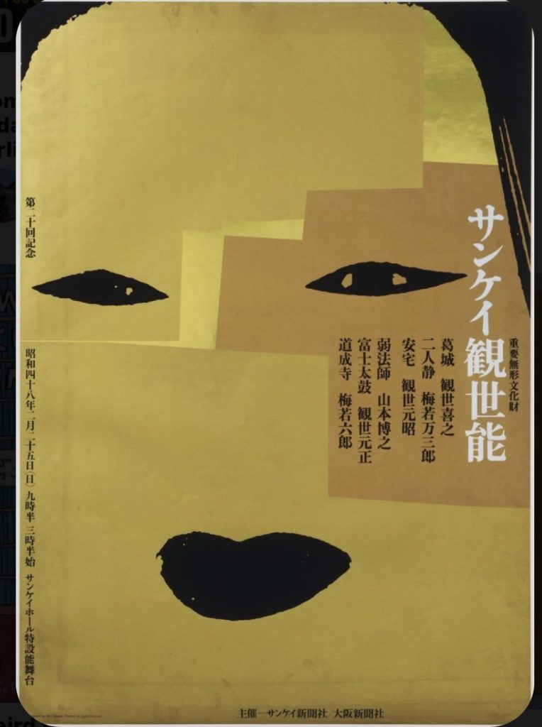
Ikko Tanaka (1930 – 2002) was a Japanese grand master of graphic design. At once highly geometric and vibrantly organic, Tanaka’s style incorporates elements of both Japanese art and Western Modernism with an abstract flair.
Many of Tanaka’s most renowned works are related to his involvement with the theatre. His most famous poster, “Nihon Buyo” (1981), perfectly creates a post-traditional, modern aesthetic, with sharp geometric contours applied to the figure of a woman in classic Japanese dress.

Tanaka’s pieces stand out for their use of contrast and masterful saturation of hue. The 1980’s were known for their transition from Modernism to Pop Art into Post-Modernism. Tanaka manages to blend these elements in such a way that every piece is like snapshot of a nascient pixelation.

Consider the playful, minimalistic contrast between the stark background and the iconic outline of what appears to be a bird’s head. The figure’s arrangement is simple yet instantly engaging. For one, the shapes used to construct the figure are both asymmetrical and mathematically precise. Though the overall outline of the bird’s head is balanced, each half of the whole is different in color and presentation. The eye is drawn to the pull of that teal eye like a wave to the moon, and I wonder if, in fact, the bird head’s left plane is meant to resemble an open window with Luna peeking through.


A series of posters designed by Ikko Tanaka. From left to right: Flower Arrangement (1978), Kaze Noh Play (1981), Hanae Mori (1977)
With its classic amber tones and cool dark hues, Flower Arrangement (1978) has an aesthetic reminiscent of ukiyo-e. The Japanese copy set atop the page resembles the calligraphic poems often added to the prints, while the smoothly contoured waves create a contemporary feel.
In Flower Arrangement (1978), an offset lithograph commemorating Kaze Noh Play (1981), Tanaka creates a powerfully vibrant image with saturated red infusing the background and the girl’s key facial features. The poster’s saturation and offset color are reminiscent of Pop Art, noting Tanaka’s appreciation of Western design. Type is expressively applied on the plane as an extension of the poster girl’s attire.
Finally, in Hanae Mori (1977), a poster designed for the eponymous fashion designer, distinguished for having been one of two Japanese women who presented their collections in Paris and New York. A fashion designer of such caliber is rare, and Tanaka succeeded in communicating the sharpness of her creative feats through shape and form.
Thanks for reading! Did any of Tanaka’s designs catch your eye? Share in the comments!

Leave a Reply